Analyzing Epidemiological Time Series With The R Package {distantia}
Summary
In this post I show how the R package
distantia can help compare and analyze epidemiological time series. The the example data comprises weekly Covid-19 prevalence curves from 36 California counties between 2020-03-16 and 2023-12-18.
The post is structured as follows:
-
Data Preparation: Transform the raw data into a time series list, the format required by
distantia. -
Exploration: Overview of data features through visualization and descriptive statistics.
-
Computing Dissimilarity Scores: Calculate time series dissimilarity using lock-step and dynamic time warping.
-
Analyzing Dissimilarity Scores: Explore methods like hierarchical clustering, mapping, and dissimilarity modeling to analyze dissimilarity scores.
DISCLAIMER: I am not an epidemiologist, so I will be focusing on the technical aspects of the applications of {distantia} to this kind of data, without any attempt to draw conclusions from the results.
R packages
This tutorial requires the following packages:
-
distantia: time series dissimilarity analysis. -
zoo: management of regular and irregular time series. -
dplyr: data frame processing. -
tidyr: to pivot a few wide data frames. -
ggplot2: to make a few charts. -
mapview: interactive spatial visualization. -
reactable: interactive tables -
factoextra: plotting results of hierarchical clustering. -
visreg: response curves of statistical models.
library(distantia)
library(zoo)
library(dplyr)
library(ggplot2)
library(mapview)
library(reactable)
library(factoextra)
library(visreg)
Example Data
We will be working with two example data frames shipped with distantia: the simple features data frame covid_counties, and the data frame covid_prevalence.
covid_counties
This
simple features data frame comprises county polygons and several socioeconomic variables. It is connected to covid_prevalence by the column name.
The socioeconomic variables available in this dataset are:
area_hectares: county surface.population: county population.poverty_percentage: population percentage below the poverty line.median_income: median county income in dollars.domestic_product: yearly domestic product in billions (not a typo) of dollars.daily_miles_traveled: daily miles traveled by the average inhabitant.employed_percentage: percentage of the county population under employment.
Note: These variables were included in the dataset because they were easy to capture from on-line sources, not because of their importance for epidemiological analyses..
covid_prevalence
Long format data frame with weekly Covid-19 prevalence in 36 California counties between 2020-03-16 and 2023-12-18. It has the columns name, time, and prevalence, with the county name, the date of the first day of the week each data point represents, and the maximum Covid-19 prevalence observed during the given week, expressed as proportion of positive tests.
Data Preparation
Before starting with the analysis, we need to transform the data frame covid_prevalence into the format required by distantia.
A time series list, or tsl for short, is a list of
zoo time series representing unique realizations of the same phenomena observed in different sites, times, or individuals. All
data manipulation and analysis functions in distantia are designed to work with all time series stored in a tsl at once.
The code below applies tsl_initialize() to covid_prevalence and returns the object tsl.
tsl <- distantia::tsl_initialize(
  x = covid_prevalence,
  name_column = "name",
  time_column = "time"
)
Each element in tsl is named after the county the data belongs to.
names(tsl)
##  [1] "Alameda"         "Butte"           "Contra_Costa"    "El_Dorado"
##  [5] "Fresno"          "Humboldt"        "Imperial"        "Kern"
##  [9] "Kings"           "Los_Angeles"     "Madera"          "Marin"
## [13] "Merced"          "Monterey"        "Napa"            "Orange"
## [17] "Placer"          "Riverside"       "Sacramento"      "San_Bernardino"
## [21] "San_Diego"       "San_Francisco"   "San_Joaquin"     "San_Luis_Obispo"
## [25] "San_Mateo"       "Santa_Barbara"   "Santa_Clara"     "Santa_Cruz"
## [29] "Shasta"          "Solano"          "Sonoma"          "Stanislaus"
## [33] "Sutter"          "Tulare"          "Ventura"         "Yolo"
The zoo objects within tsl also have the attribute name to help track the data in case it is extracted from the time series list.
attributes(tsl[[1]])$name
## [1] "Alameda"
attributes(tsl[[2]])$name
## [1] "Butte"
Each individual zoo object comprises a time index, extracted with zoo::index(), and a data matrix accessed via zoo::coredata().
zoo::index(tsl[["Alameda"]]) |>
  head()
## [1] "2020-03-16" "2020-03-23" "2020-03-30" "2020-04-06" "2020-04-13"
## [6] "2020-04-20"
zoo::coredata(tsl[["Alameda"]]) |>
  head()
##   prevalence
## 1       0.01
## 2       0.01
## 3       0.01
## 4       0.01
## 5       0.01
## 6       0.02
Exploration
In the package distantia there are several tools to help you visualize your time series and explore their basic properties.
Visualization
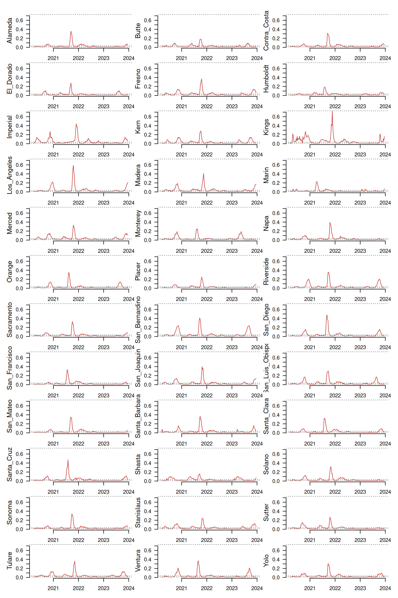
The function tsl_plot() provides a static multipanel visualization of a large number of time series at once.
distantia::tsl_plot(
  tsl = tsl,
  columns = 3,
  guide = FALSE,
  text_cex = 1.2
)
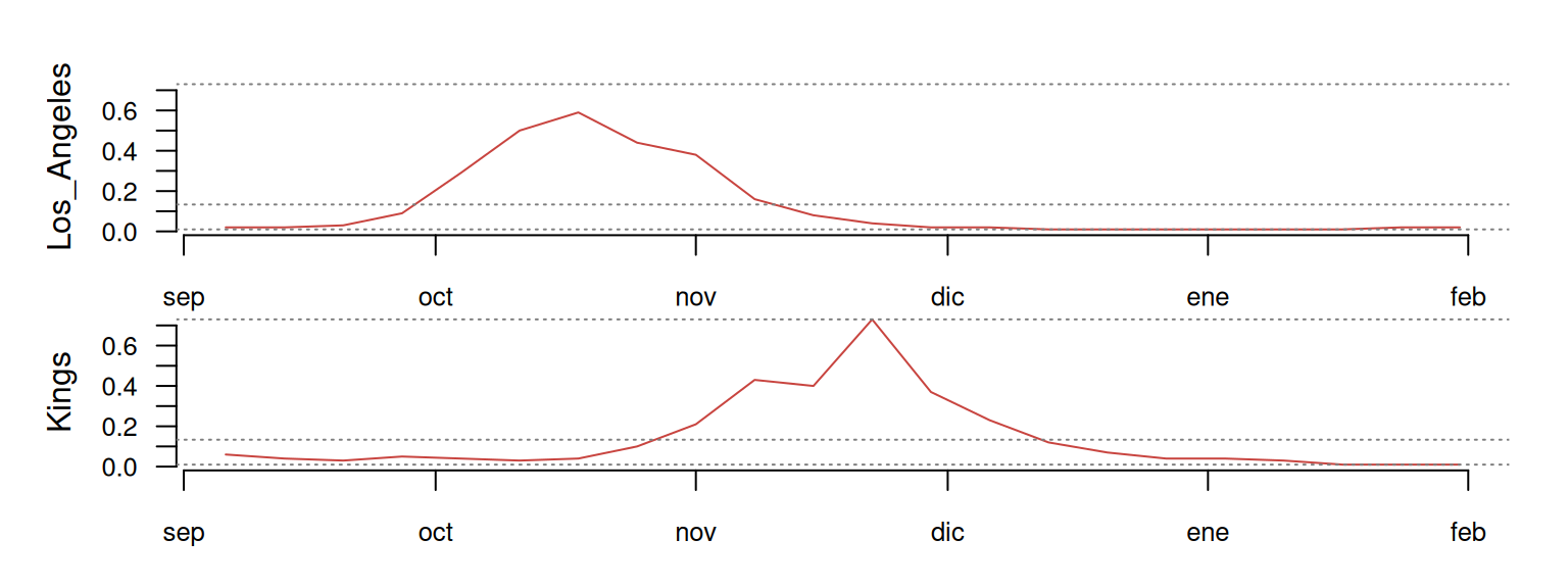
If we combine tsl_subset() with tsl_plot(), we can focus on any particular sub-group of counties and zoom-in over specific time periods.
distantia::tsl_plot(
  tsl = tsl_subset(
    tsl = tsl,
    names = c("Los_Angeles", "Kings"),
    time = c("2021-09-01", "2022-01-31")
  ),
  guide = FALSE
)
Descriptive Stats
Having a good understanding of the time in a time series is important, because details such as length, resolution, time units, or regularity usually define the design of an analysis. Here, the function tsl_time() will give us all relevant details about the time in a time series list.
df_time <- distantia::tsl_time(
  tsl = tsl
)
In our case all time series are regular and have the same time resolution and range, which makes the table above rightfully boring.
Once acquainted with time, having a summary of the values in each time series also helps make sense of the data, and that’s where tsl_stats() comes into play.
df_stats <- distantia::tsl_stats(
  tsl = tsl,
  lags = 1:6 #weeks
)
The first part of the output corresponds with common statistical descriptors, such as centrality and dispersion metrics, and higher moments.
The second part, produced by the lags argument, shows the temporal autocorrelation of the different time series. Given that the resolution of all time series is 7 days per data-point, each time lag represents a week. A value of 0.9 for the lag 1 indicates the Pearson correlation between prevalence values in consecutive weeks.
The autocorrelation values for each lag across all counties are summarized in the following boxplot.
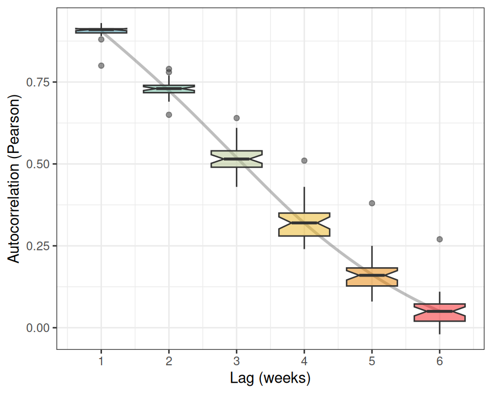
According to the boxplot, our prevalence time series show a very strong short-term (1-2 weeks) memory, and a rapid diminishment of long-term memory (5-6 weeks), suggesting that the influence of past prevalence on future values dissipates quickly.
The stats produced by tsl_stats() can be joined to covid_counties using their common column name.
sf_stats <- dplyr::inner_join(
  x = covid_counties[, "name"],
  y = df_stats,
  by = "name"
)
After the join, we can map any of these stats with mapview(). For example, the map below shows the maximum prevalence per county across the full period.
mapview::mapview(
  sf_stats,
  zcol = "q3",
  layer.name = "Max prevalence",
  label = "name",
  col.regions = distantia::color_continuous()
  )
If you wish to compute stats for a given period or group of counties, then you can combine tsl_subset() and tsl_stats(), as we did before.
df_stats_2021 <- distantia::tsl_stats(
  tsl = tsl_subset(
    tsl = tsl,
    names = c("Napa", "San_Francisco"),
    time = c("2021-01-01", "2021-12-31")
  ),
  lags = 1:6
)
Computing Dissimilarity Scores
The package distantia was designed to streamline the comparison of time series using two methods: Lock-Step (LS) and and
Dynamic time warping (DTW). In this section I explain both methods in brief, demonstrate how they work, and show how to compute them to compare all our prevalence time series.
Dynamic Time Warping and Lock-Step Comparison
LS directly compares values at the same time points in equal-length time series. It is efficient and interpretable but cannot adjust for differences in outbreak timing, potentially missing relevant time series similarities.
DTW aligns time series by warping the time axis to maximize shape similarity. It accounts for differences in outbreak timing, making it useful for uneven-length or misaligned time series. However, it is computationally expensive, harder to interpret, and sensitive to scaling.
Before moving forward, let me show you a small example focused on San Francisco, Napa, and Solano to illustrate how LS and DTW work.
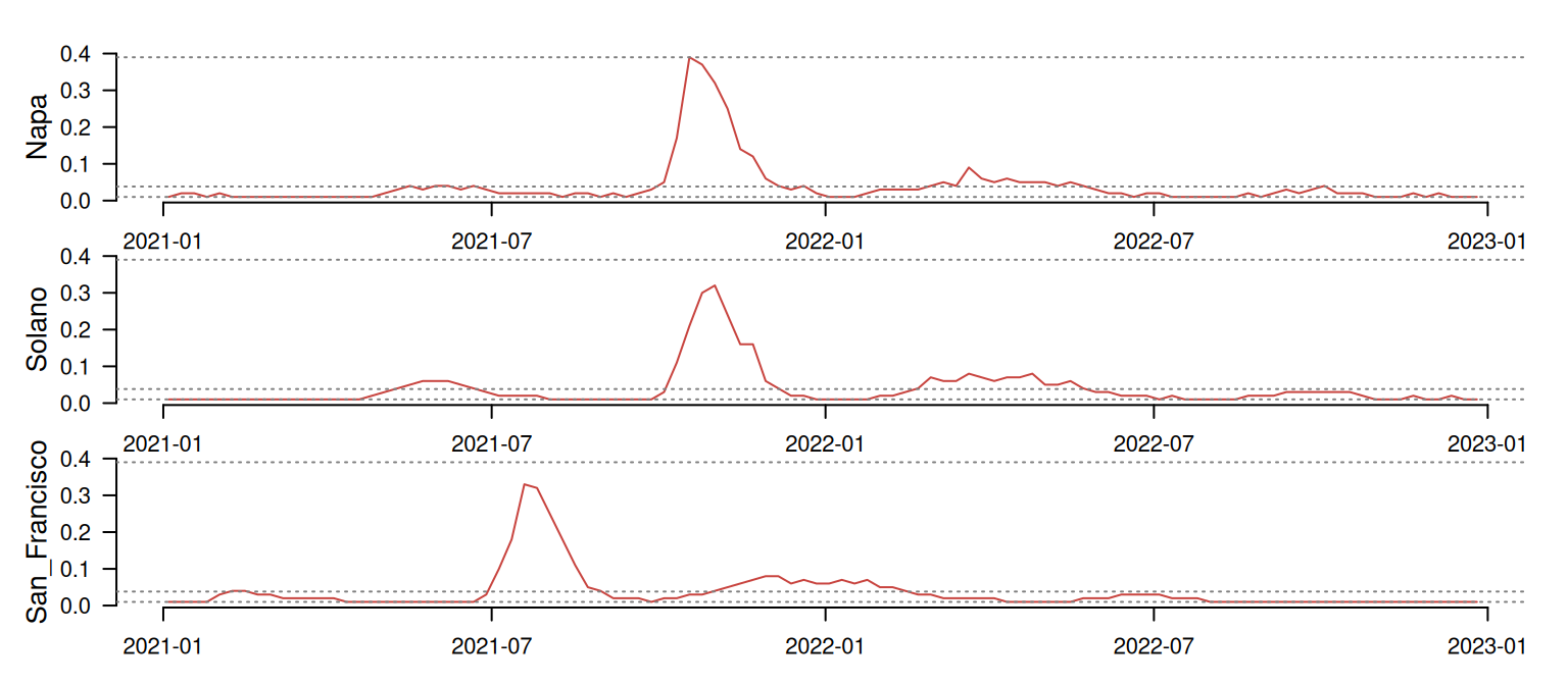
At first glance, Napa and Solano seem quite well synchronized, while San Francisco shows a timing difference of several months. The table below shows the LS comparison between these time series. The psi column indicates the dissimilarity between pairs of time series. The smaller the value, the more similar the time series are.
tsl_smol |>
  distantia::distantia_ls() |>
  dplyr::mutate(
    psi = round(psi, 3)
  ) |>
  reactable::reactable(
    resizable = TRUE,
    striped = TRUE,
    compact = TRUE,
    wrap = FALSE,
    fullWidth = FALSE
  )
As we could expect, Napa and Solano show the lower psi score, indicating that these are the most similar pair in this batch. LS seems to be capturing their synchronicity quite well! On the other hand, San Francisco shows a high dissimilarity with the other two time series, as expected due to its asynchronous pattern. So far so good!
Now, let’s take a look at the DTW result:
tsl_smol |>
  distantia::distantia_dtw() |>
  dplyr::mutate(
    psi = round(psi, 3)
  ) |>
  reactable::reactable(
    resizable = TRUE,
    striped = TRUE,
    compact = TRUE,
    wrap = FALSE,
    fullWidth = FALSE
  )
Surprisingly, when adjusting for time shifts, San Francisco appears more similar to Solano than Napa!
This happens because DTW ignores absolute dates, and allows any sample in a time series to map to multiple samples from the other. That’s where the time warping happens! The left side of the plot below shows San Francisco’s (dashed red line) first case aligning with a group of Napa samples with prevalence 0, effectively canceling their timing differences.
## Loading required package: proxy

##
## Attaching package: 'proxy'

## The following objects are masked from 'package:stats':
##
##     as.dist, dist

## The following object is masked from 'package:base':
##
##     as.matrix

## Loaded dtw v1.23-1. See ?dtw for help, citation("dtw") for use in publication.
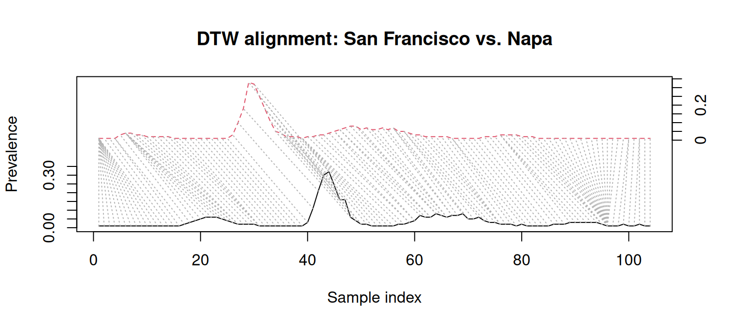
These results suggest that, in spite of their timing differences, San Francisco, Napa, and Solano have a similar dynamics. This is a conclusion LS alone would miss!
It is for this reason that a DTW analysis is preferable when outbreak timing varies significantly and shape similarity is more important than exact time alignment. On the other hand, LS is best applied when the question at hand is focused on time-series synchronization rather than shape similarity.
Computing DTW and LS with distantia
The most straightforward way of computing DTW and LS in distantia involves the functions distantia_ls() and distantia_dtw(). Both are simplified versions of the function distantia(), which has a whole set of bells and whistles that are out of the scope of this post.
The function distantia_ls() computes lock-step dissimilarity using euclidean distances by default. It returns a data frame with the columns x and y with the time series names, and the psi score.
df_psi_ls <- distantia::distantia_ls(
  tsl = tsl
  )

str(df_psi_ls)
## 'data.frame':	630 obs. of  3 variables:
##  $ x  : chr  "Napa" "Alameda" "Alameda" "Sacramento" ...
##  $ y  : chr  "Solano" "San_Mateo" "Contra_Costa" "Sonoma" ...
##  $ psi: num  0.873 1.066 1.162 1.258 1.292 ...
##  - attr(*, "type")= chr "distantia_df"
The function distantia_dtw() returns an output with the same structure. You will notice that it runs a bit slower than distantia_ls().
df_psi_dtw <- distantia::distantia_dtw(
  tsl = tsl
  )

str(df_psi_dtw)
## 'data.frame':	630 obs. of  3 variables:
##  $ x  : chr  "Sacramento" "Contra_Costa" "Contra_Costa" "Alameda" ...
##  $ y  : chr  "Sonoma" "Sacramento" "Sonoma" "Sonoma" ...
##  $ psi: num  0.352 0.364 0.371 0.375 0.375 ...
##  - attr(*, "type")= chr "distantia_df"
The table below combines both results to facilitate a direct comparison between both dissimilarity scores.
Here goes a scatterplot between the columns psi_dtw and psi_ls, in case you are wondering how these two metrics are related in our experiment.
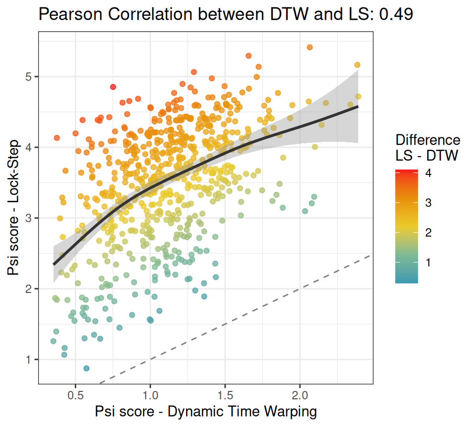 The chart shows that there is good correlation between the
 psi scores for DTW and LS, so in principle, using one or the other might not be that important, as they may lead to similar conclusions. However, notice all these cases with a warmer color in the upper-left corner. These represent pairs of time series with a large dissimilarity mismatch between DTW and LS. Remember San Francisco versus Napa? If these cases are important to your research question, then DTW is the method of choice. Otherwise, LS is a reasonable alternative.
In the end, the research question must guide the methodological choice, but it is up to us to understand the consequences of such choice.
Analyzing Dissimilarity Scores
In this section we will have a look at the different kinds of analyses implemented in distantia that may help better understand how time series are related. For the sake of simplicity, I will focus on the DTW results alone. If you wish to use the LS results instead, just replace df_psi_dtw with df_psi_ls in the code below.
df_psi <- df_psi_dtw
Summary Stats
The functions distantia_stats() and distantia_boxplot() provide alternative summarized representations of dissimilarity by aggregating psi scores across all time series.
df_psi_stats <- distantia::distantia_stats(
  df = df_psi
)
The boxplot generated by distantia_boxplot() serves as a quick visual summary of the table above.
distantia::distantia_boxplot(
  df = df_psi,
  text_cex = 1.4
)
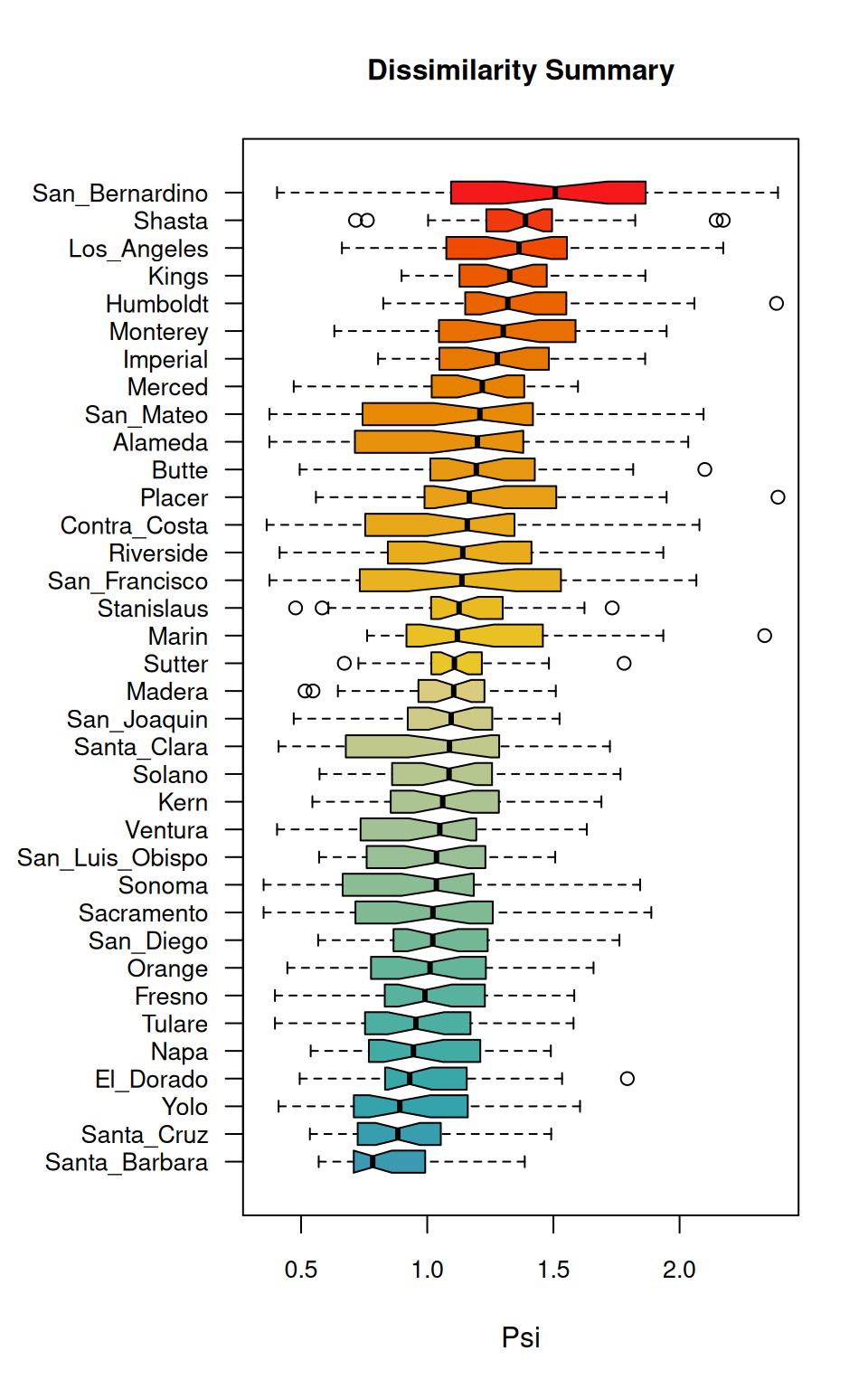 According to the boxplot, San Bernardino is the county with a higher overall dissimilarity with all others. On the other hand, at the bottom of the boxplot, Santa Barbara seems to be the most similar to all others.
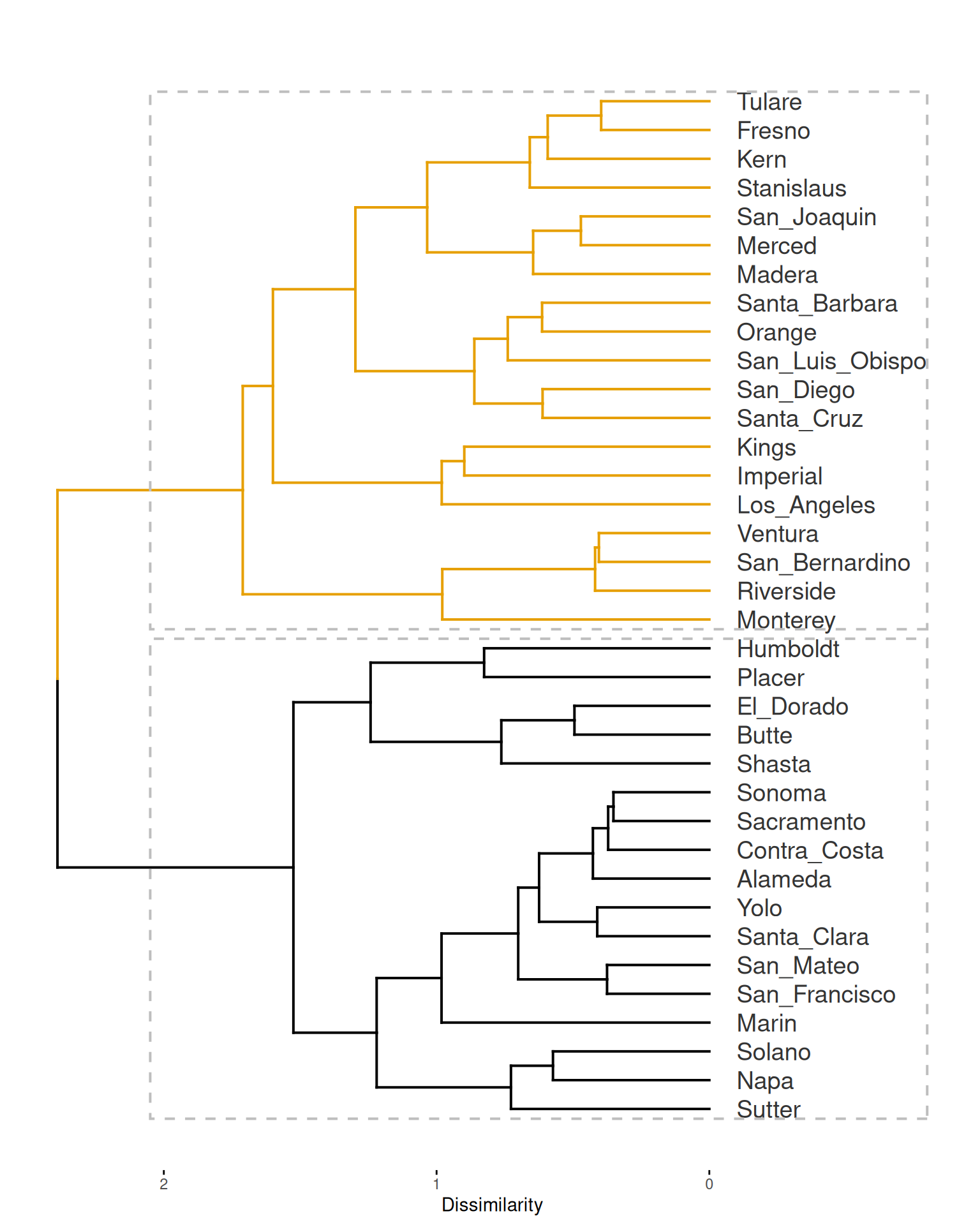
Hierarchical Clustering
The functions distantia_cluster_hclust() and distantia_cluster_kmeans() are designed to apply hierarchical and K-means clustering to the data frames produced by distantia_dtw() and distantia_ls(). In this section we will be focusing on hierarchical clustering.
By default, the function distantia_cluster_hclust() selects the clustering method (see argument method in help(hclust)) and the number of groups in the clustering solution via silhouette-width maximization (see
distantia::utils_cluster_silhouette() and
distantia::utils_cluster_hclust_optimizer() for further details).
psi_cluster <- distantia::distantia_cluster_hclust(
  df = df_psi
)

names(psi_cluster)
## [1] "cluster_object"   "clusters"         "silhouette_width" "df"
## [5] "d"                "optimization"
The output is a list with several components, but these are the key ones:
df: data frame with time series names, cluster assignation, and silhouette width.cluster_object: the output ofstats::hclust().clusters: the number of distinct clusters selected by the algorithm.
The object df has the column silhouette_width, in the range [-1, 1], which informs about how well each case fits within its assigned cluster:
<0: misclassified.≈0: near decision boundary.≈1: well-clustered.
If you arrange the table above by silhouette_width, you will notice that “Santa Cruz”, has a silhouette score of -0.049, which highlights it as the county with the most dubious cluster membership.
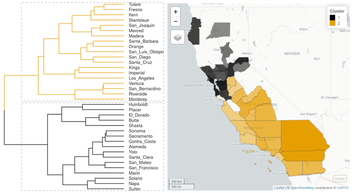
The cluster object can be plotted as a dendrogram with factoextra::fviz_dend(), using the number of clusters in the object psi_cluster$clusters as guide to colorize the different branches.
#number of clusters
k <- psi_cluster$clusters

factoextra::fviz_dend(
  x = psi_cluster$cluster_object,
  k = k,
  k_colors = distantia::color_discrete(n = k),
  cex = 1,
  label_cols = "gray20",
  rect = TRUE,
  horiz = TRUE,
  main = "",
  ylab = "Dissimilarity"
  )
Mapping these groups may be helpful for the ones like me not fully acquainted with the distribution of counties in California. To get there we first need to join psi_cluster$df to the spatial data frame covid_counties.
sf_cluster <- dplyr::inner_join(
  x = covid_counties[, "name"],
  y = psi_cluster$df,
  by = "name"
)
Now we can use mapview::mapview() again to plot cluster membership, but with a twist: we are going to code the silhouette score of each case as polygon transparency, with higher transparency indicating a lower silhouette width. This will help identify these cases that might not fully belong to their assigned groups.
Notice that to do so, the code below applies distantia::f_rescale_local() to rescale silhouette width between 0.1 and 1 to adjust it to what the argument alpha.regions expects.
mapview::mapview(
  sf_cluster,
  zcol = "cluster",
  layer.name = "Cluster",
  label = "name",
  col.regions = distantia::color_discrete(n = k),
  alpha.regions = distantia::f_rescale_local(
    x = sf_cluster$silhouette_width,
    new_min = 0.1
    )
  )
The map shows something the dendrogram could not: the two groups of counties are geographically coherent! Additionally, the map shows that Santa Cruz, the county with a more dubious cluster membership, is surrounded by counties from the other cluster.
Dissimilarity Modelling
Dissimilarity scores reveal the degree of interrelation between time series but do not explain the reasons behind their dissimilarity.
To fill this gap, in this section I show how dissimilarity scores and geographic and socioeconomic variables can be combined to fit models that may help unveil relevant drivers of dissimilarity between epidemiological time series.
Building a Model Frame
The function
distantia_model_frame() builds data frames for model fitting. In the code below we use it to combine the dissimilarity scores stored in df_psi with socioeconomic count variables stored in covid_counties.
df_model <- distantia::distantia_model_frame(
  response_df = df_psi,
  predictors_df = covid_counties,
  scale = FALSE
)
Let’s take a look at the output.
The model frame df_model has the following components:
- Time series identifiers: in this case, county names in the columns
xandy. These columns are not used during model fitting. - Response variable: column
psifromdf_psi, representing time series dissimilarity. - Predictors: the columns with socioeconomic data in
covid_countiesare transformed into absolute differences between each pair of counties. For example, the value of the columnarea_hectaresfor the counties Sacramento and Sonoma is 1.5574908^{5} hectares. This is the absolute difference between the area of Sacramento (2.5695387^{5} hectares) and the area of Sonoma (4.1270295^{5} hectares). - Geographic distance: the column
geographic_distance, not incovid_counties, represents the distance between county limits. It is computed when the input of the argumentpredictors_dfis spatial data frame.
The function distantia_model_frame() has anotehr neat feature: it can combine different predictors into a new one!
In the example below, the predictors poverty_percentage, median_income, employed_percentage, daily_miles_traveled and domestic_product are scaled, and their multivariate distances between pairs of counties are computed and stored in the column economy. This new variable represents overall differences in economy between counties.
Notice that the code below applies log transformations to the county areas and populations, and square root transformation to the geographic distances between counties. Finally, it also scales the predictors, because in distantia version <= 2.0.2 the argument scale of distantia_model_frame() does not work as it should (this issue is fixed in version 2.0.3).
df_model <- distantia::distantia_model_frame(
  response_df = df_psi,
  predictors_df = covid_counties |>
    dplyr::mutate(
      area = log(area_hectares),
      population = log(population)
    ),
  composite_predictors = list(
    economy = c(
      "poverty_percentage",
      "median_income",
      "domestic_product",
      "employed_percentage",
      "daily_miles_traveled"
    )
  ),
  #scale = TRUE is broken in version <= 2.0.2
  scale = FALSE
  ) |>
  #selecting and renaming columns
  dplyr::transmute(
    x,
    y,
    psi,
    economy,
    population,
    area,
    distance = sqrt(geographic_distance)
  ) |>
  #scale
  dplyr::mutate(
    dplyr::across(
      dplyr::all_of(c("economy", "distance", "population", "area")),
      ~ as.numeric(scale(.x))
    )
  )
Now, with the model frame at hand, we are ready to better understand how the dissimilarity between prevalence time series changes as a function of differences between counties in distance, area, economy, and population.
Fitting a Linear Model
Since our model frame shows no multicollinearity between predictors (you can check it with cor(df_model[, -1])), it can be used right away to fit a multiple regression model.
m <- stats::lm(
  formula = psi ~ distance + area + economy + population,
  data = df_model
)
The model has an R-squared of 0.29, which is not great, not terrible.
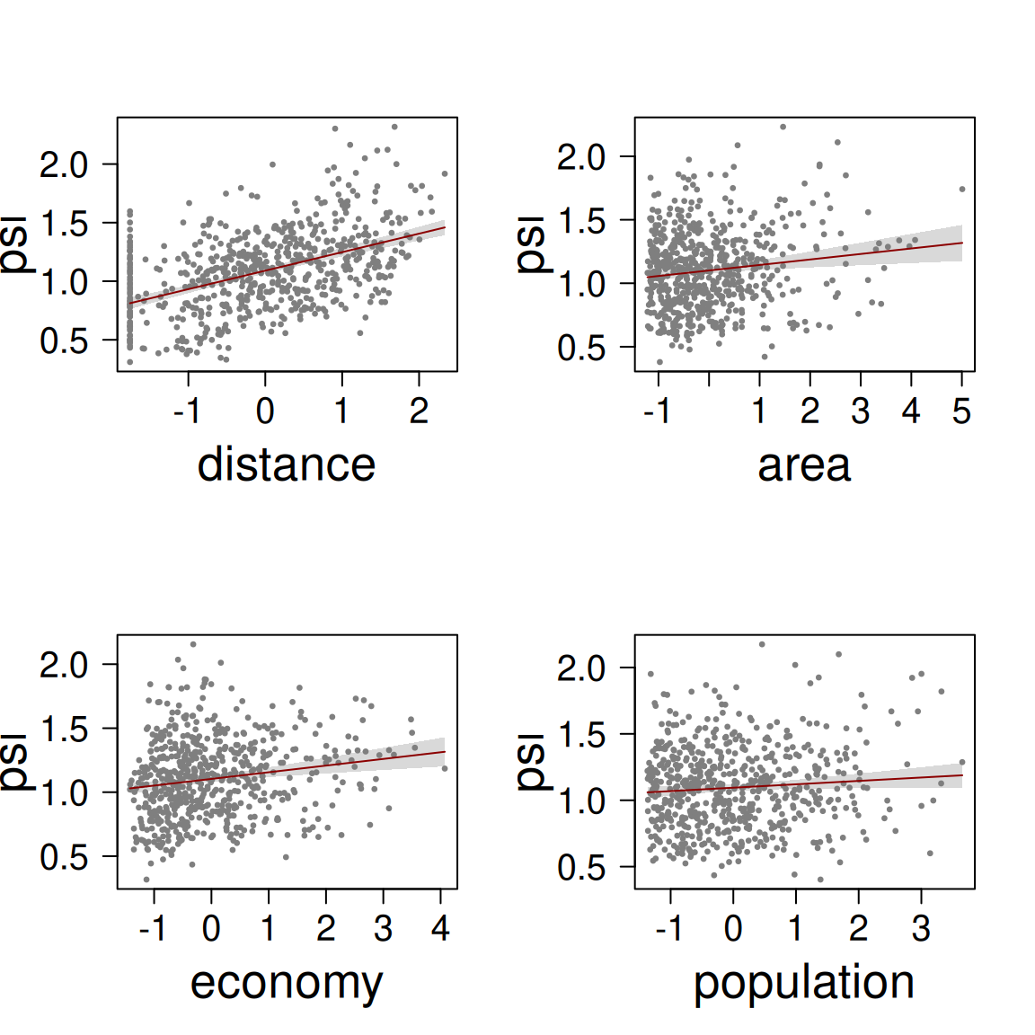
The coefficients table and the effects plot support the idea that all predictors have a positive relationship with dissimilarity between prevalence time series. The predictor distance has the strongest effect, which is almost trhee times the effect economy and area, and more than six times the effect of population.
The scatterplot below confronts the observations versus the model predictions. This kind of plot is known as calibration plot, and helps assess prediction bias in a model.
df_model$psi_predicted <- stats::predict(object = m)

ggplot(df_model) +
  aes(
    x = psi,
    y = psi_predicted
  ) +
  geom_point(alpha = 0.5, col = "gray50") +
  coord_fixed(
    xlim = range(c(df_model$psi, df_model$psi_predicted)),
    ylim = range(c(df_model$psi, df_model$psi_predicted))
  ) +
  geom_smooth(
    method = "lm",
    col = "red4",
    formula = y ~ x
    ) +
  geom_abline(
    intercept = 0,
    slope = 1,
    col = "black",
    lty = 2
  ) +
  labs(
    x = "Observed psi",
    y = "Predicted psi",
    title = "Calibration plot - Linear Model"
  ) +
  theme_bw()
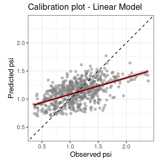
The calibration plot shows that our model underpredicts high and overpredicts low dissimilarity values. This kind of bias indicates that there are relevant predictors, interactions, or transformations missing from the model. At this point we could look for more meaningful variables, we could disaggregate the variable economy, or maybe decide that this linear model does not fit our purpose and try with a different modelling method.
In any case, we are going to stop the modelling exercise here, because it could go on for a while, and this post is freaking long already. Whatever comes next is up to you now!
Closing Thoughts
In this rather long post I’ve gone through the main functionalities in distantia that are helpful to better understand how univariate epidemiological time series are related and to explore drivers of dissimilarity. However, there are other utilities in distantia that may be useful in this field, such as network plots, which are described in the post
Mapping Time Series Dissimilarity, and time-delay analysis, as implemented in the function
distantia_time_delay(). I hope I’ll have time to combine these ideas in a new post soon.
And that’s all folks, I hope you got something to take home from this tutorial!
BMB